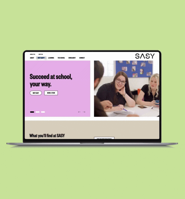
SASY is an independent secondary school built for young people who need a different path for their education. Their founders believed that every young person could have both their educational and wellbeing needs met at school. They created a place of opportunity for young people to reconnect with education, wellbeing and purpose.
We would like to thank you for all your hard work and dedication on this project we have had great feedback on the design and ease of navigation, so a massive shout out to you and your team for that!
- SASY
SASY’S existing website wasn’t telling their story, or carrying their workload. They needed a website that tells their story simply, supports key audiences, and could be updated in-house without breaking. Priorities included clear pathways to enrolment and tours, showcasing multiple learning spaces, lightweight integrations for event bookings and forms, strong accessibility and mobile performance, and meaningful SEO/analytics so the team can learn and improve.
It also needed to reflect SASY’s trauma-informed, non-judgemental tone while meeting accessibility standards, supporting multiple locations, and integrating everyday tools like forms and TryBooking. Without turning every change into a mini project.
In short, SASY required a calm, credible, future-proof site that reduces anxiety, earns trust quickly, and gives the team real control over content, structure and growth.
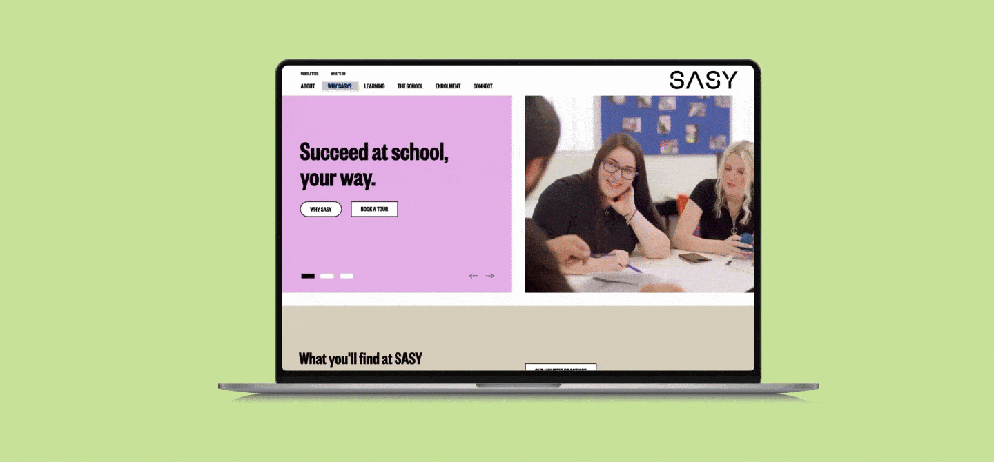
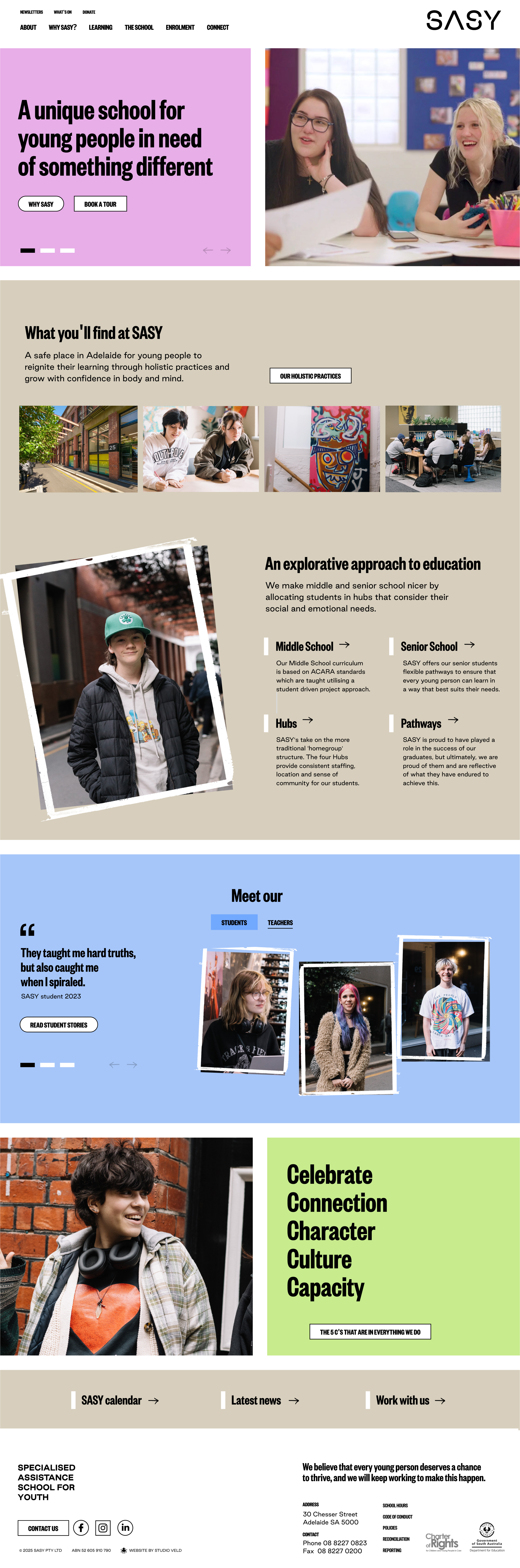
SASY made it clear to us that their audience might be going through a difficult time, so everything about their website needed to be easy to use. We reframed the experience around real tasks and trust signals, then rebuilt the site as a modular, mobile-first system in Craft CMS. Information Architecture was simplified to five clear hubs. Tour SASY, Enrolment, Programs, Support, and Policies; each with plain-language summaries, short paths (≤3 taps), and consistent calls to action.
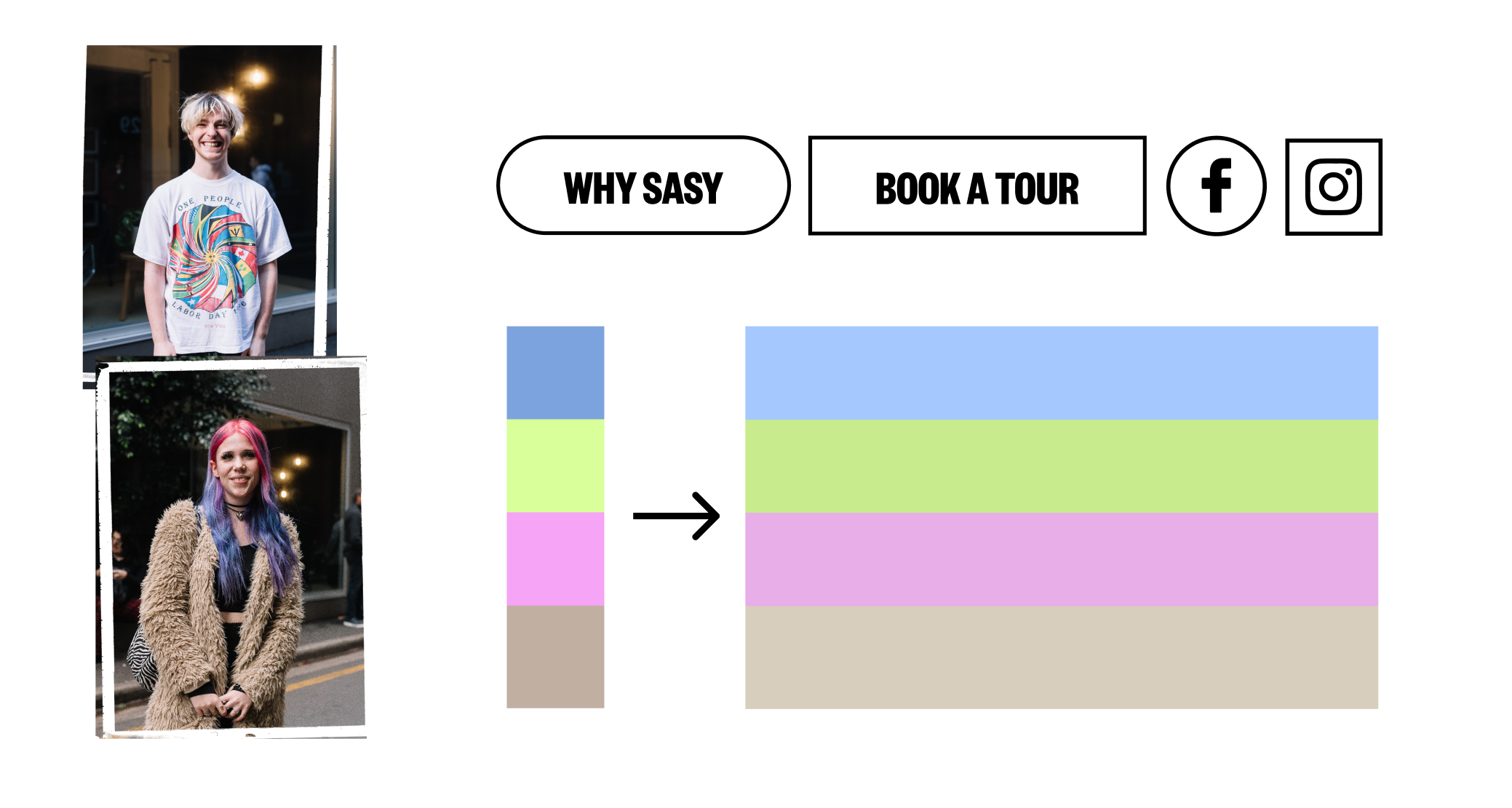
We designed accessible components with AA/AAA contrast, which meant a slight adjustment to their new brand colour palette to fit the digital context, visible focus states, and friendly microcopy that mirrors SASY’s values. SASY editors now assemble pages from reusable blocks, so content stays on-brand. Key integrations such as consolidated forms, links, structured data for schools, privacy-safe analytics, are baked in. The result is a website that feels human, loads fast on a phone, which makes it easy for families to find help, and for staff to keep everything current.
A design system built on a fluid grid that allows the information to fit in flexible, playful chunks.
Goal: To organise the content structure in a way that delivers an appealing, smooth, friendly user journey.
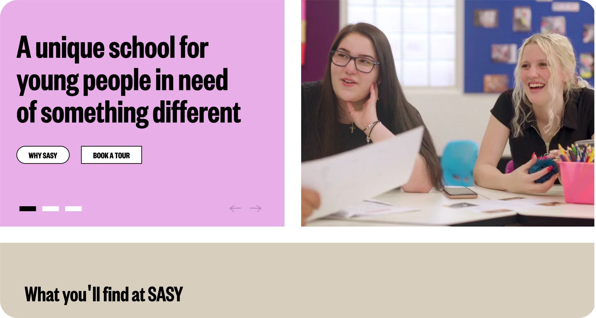
The brand’s colour palette was adapted for accessibility, button interactions reflect SASY’s adaptability, the brand’s photo brush styles keep the brand’s essence.
Goal: To design a User Interface that would appeal to a diverse range of people.
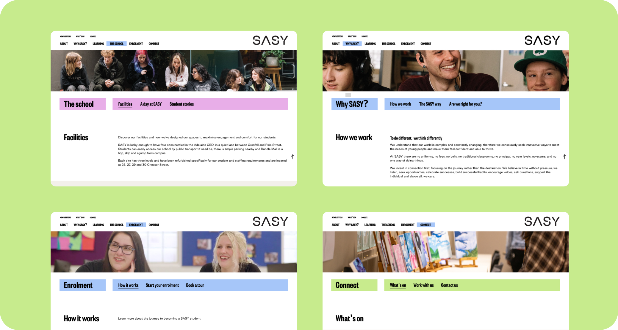
A flexible template system that allows the client to populate the website with large amounts of content.
Goal: To make it easy for the client to update content and maintain the brand.